

Appearance
Feed Views
The activity feed in FluentCommunity keeps members up to date on recent posts, comments, and other activity. It offers three view modes so everyone can browse the way they prefer: Card View, List View, and Timeline View. Here's how each one works and how to switch between them.
Use Case: Your community shares a lot of visual, image-heavy posts. Switching to Card View lets members scan updates as a grid of thumbnails, while a text-focused group might prefer the compact List View instead.
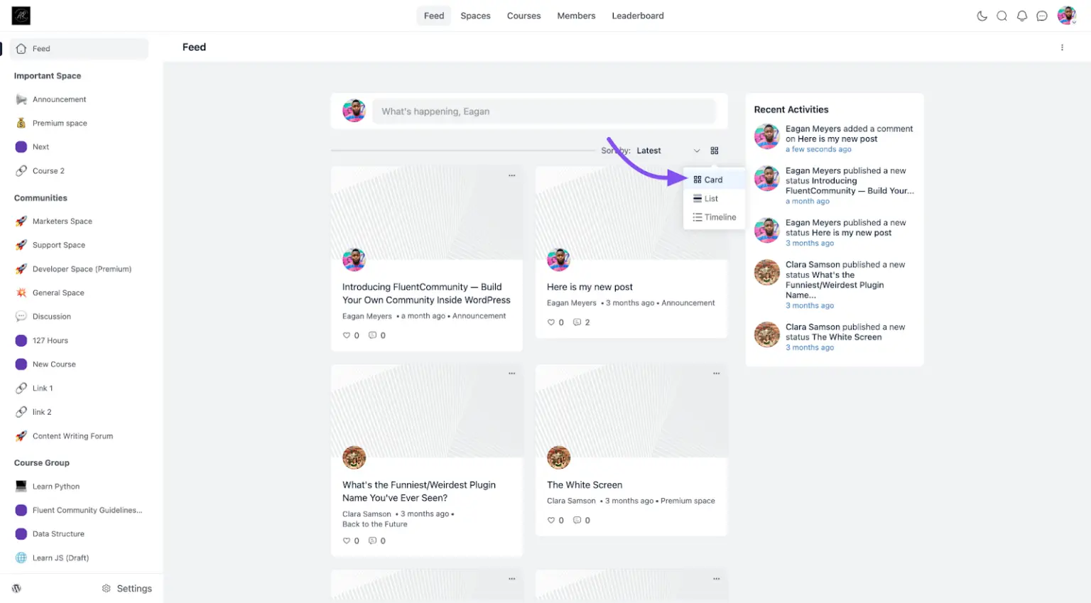
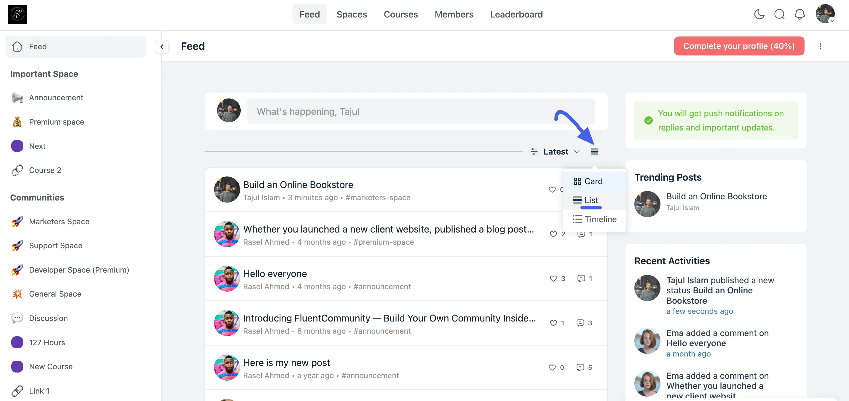
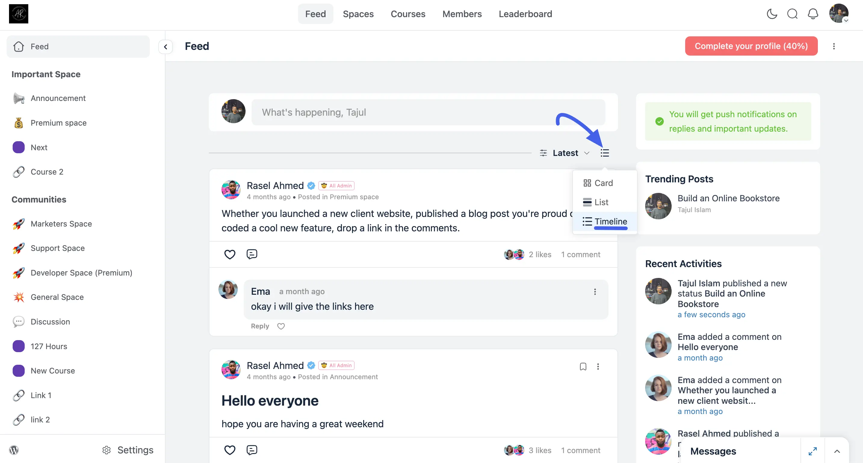
To switch between views, click the small view icon next to the Latest sort dropdown above the feed, then choose Card, List, or Timeline from the popover.
Card View
- Layout: A two-column grid where each post is an individual card, a large preview image on top, then the author's avatar, post title, author name, time, and Space, with like and comment counts at the bottom.
- Best for: Members who like a visual grid to scan content at a glance.
Posts that contain a video show a thumbnail preview pulled from the video itself, instead of a generic placeholder, so members can spot video content while scanning the grid without opening the post first.
Card View is also available as a default layout option in the Space Settings section.
List View
- Layout: A compact single-column list, each row is just the author's avatar, post title, and a byline (author, time, and Space or hashtag), with like and comment counts on the right, no preview image.
- Best for: Members who want to scan a lot of post titles quickly without images taking up space.
Timeline View
- Layout: A single-column feed of expanded posts, showing each post's full text, the author's name with their verified and role badges, and any replies threaded directly underneath, without opening the post.
- Best for: Members who want to read full post content and follow the conversation right from the feed.
Each view lets members choose the style that best fits how they like to keep up with a Space's activity.