

Appearance
Customizing The Lockscreen
The Lock Screen is the "front door" to your gated content. When a non-member or a logged-out user tries to access a private Space, they won't see an "Access Denied" error; instead, they see this custom-designed page. It is your opportunity to explain the value of your Space and provide a clear path for users to join.
How to Access the Editor
Each Space has its own unique Lock Screen configuration.
- Navigate to the specific Space you want to edit.
- Click the three-dot (vertical ellipsis) menu in the top-right corner of the Space header.
- Select Space Settings from the dropdown menu.
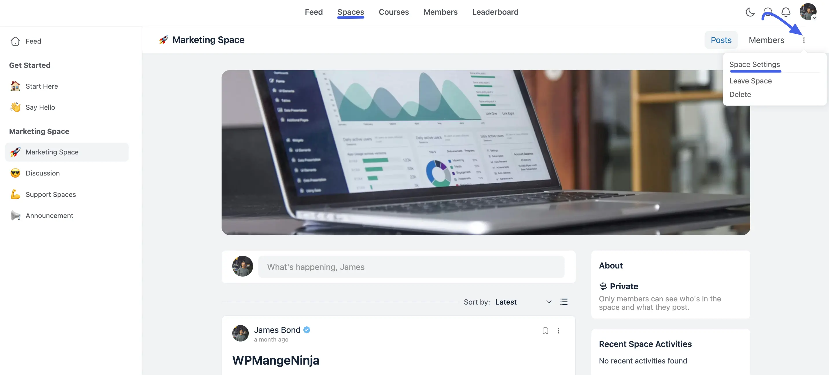
- Once the settings modal opens, click the Lock Screen tab at the top.
💡 Pro Tip: If you don't see the Lock Screen tab, go to the General Settings tab and ensure Privacy is set to Private or Secret, and the Lock Screen Type is set to Custom.
On the left, you will see a list of active blocks like Banner, Description, and Call to Action. You can click on the Pencil icon button for these labels to jump directly to the settings for that section.
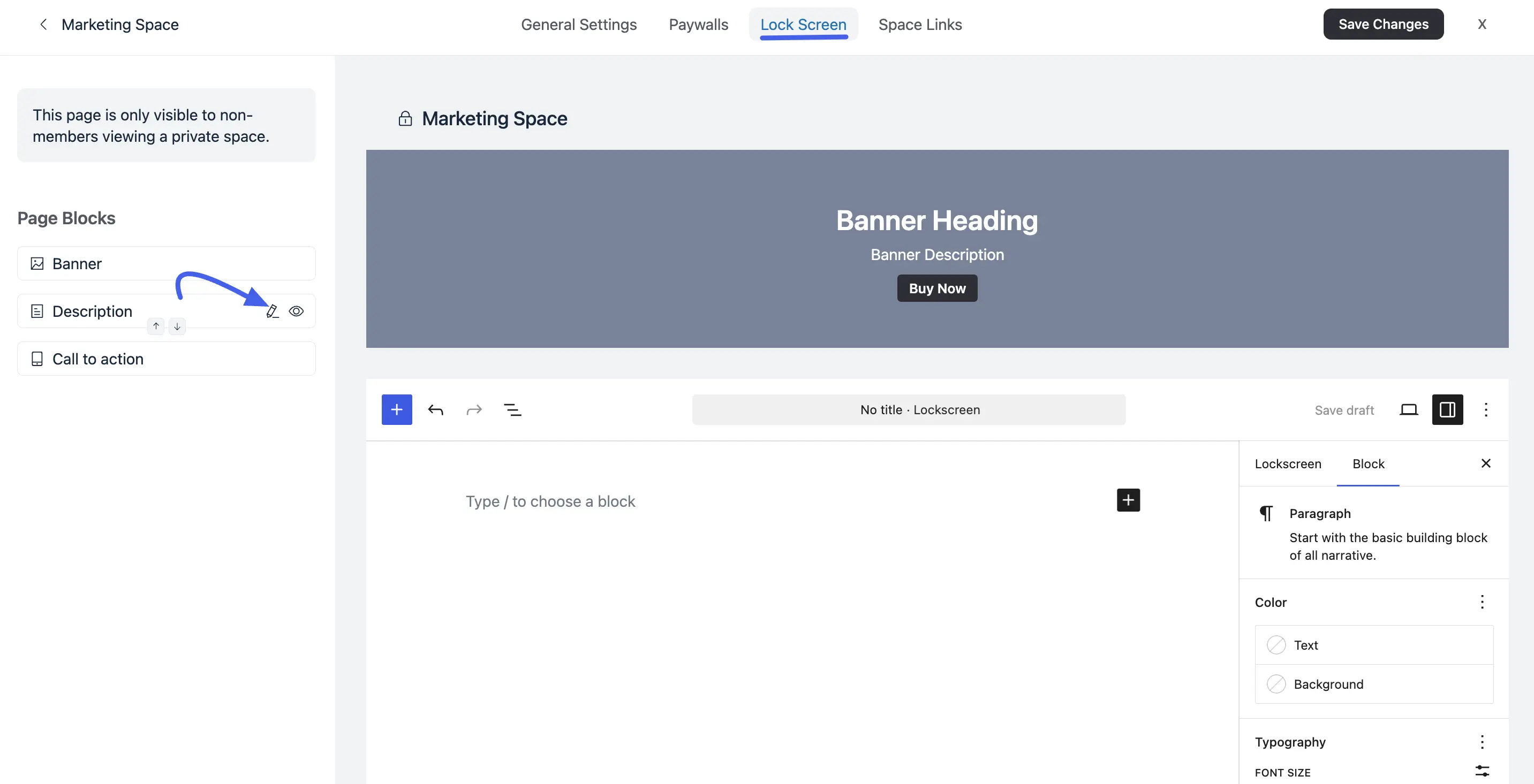
Building Your Lock Screen Page
The Lock Screen uses a visual, block-based builder that allows you to see your changes in real-time.
1. Banner Block
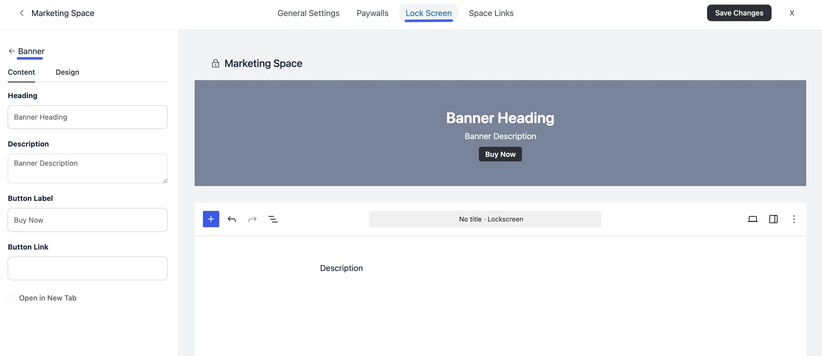
When you click on the Pencil icon button to edit the Banner section, the left sidebar will show the Content tab:
- Heading: Enter a catchy title.
- Description: Use this space to list the benefits of joining, what members get, and why it's worth it.
- Button Label: Customize the text on your action button, such as "Join Now," "Get Instant Access," or "Enroll Today".
- Button Link: Enter the destination URL (e.g., your FluentCart checkout page).
- Open In New Tab: Use this toggle if you want to keep the current page open while the user goes to the checkout.
Designing the Visuals
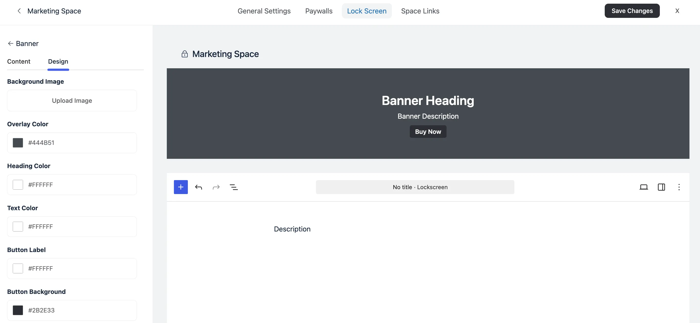
The Design tab allows you to match the Lock Screen to your brand:
- Background Image: Upload a high-quality image that reflects your community's vibe.
- Overlay Color: Add a semi-transparent color over your image to make sure your text stands out and is easy to read.
- Text & Heading Colors: Adjust these colors to ensure high contrast against your background.
- Button Styling: Change the Button Background color and the Button Label text color to make your Call to Action "pop".
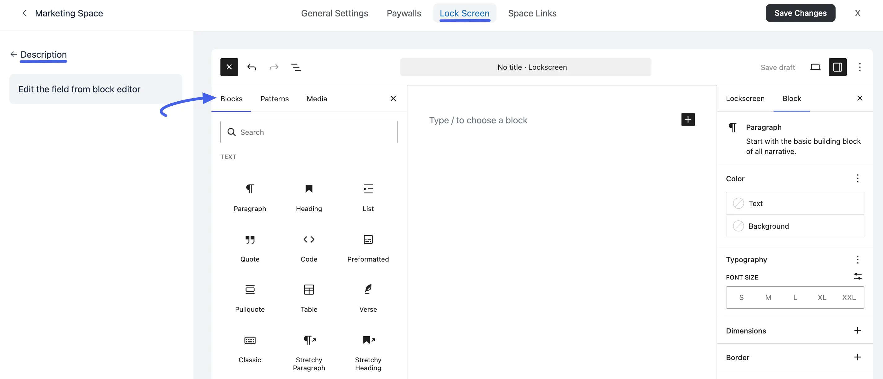
2. Gutenberg Supported Description Block
The Gutenberg Description is a great way to change your lock screen a lot! Because the description area uses the Gutenberg Editor, you can design your Lock Screen Page with any look you want.
- The (+) Plus Button: Click this to open the block library. You can add Text (headings, paragraphs), Media (images, video covers), and Layout elements (columns, buttons).
3. Call to Action Block
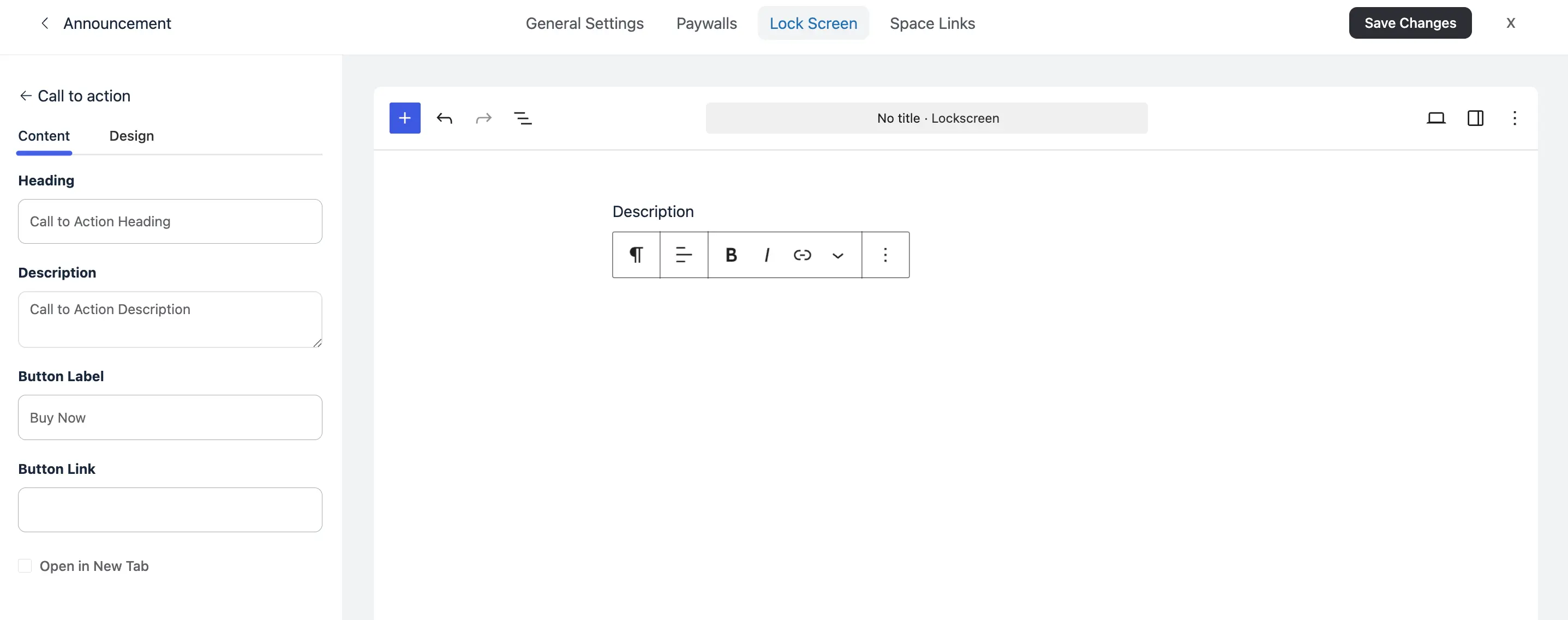
The Call to Action section is mainly for the 'Call to Action' button on your Lock Screen.
You can change the look of this section in the same way you change the Banner Block section. You will find the same settings for Content and Design here.
Saving Your Work
Once you are happy with the layout and design, click the Save Changes button in the top right corner. Your custom landing page is now live and will be shown to every non-member who visits that Space URL.