Appearance
Color Customization
FluentCommunity lets you customize the color of almost every part of your portal, including the Navbar, Sidebar, Feed, Content, Links, Text, and Buttons. The interface supports both Light and Dark themes, and you can style each mode independently so your community looks great either way.
Use Case: You want your community portal to match your brand's palette, with a bright, airy look in Light mode and a comfortable, low-glare scheme in Dark mode.
How to Customize Colors
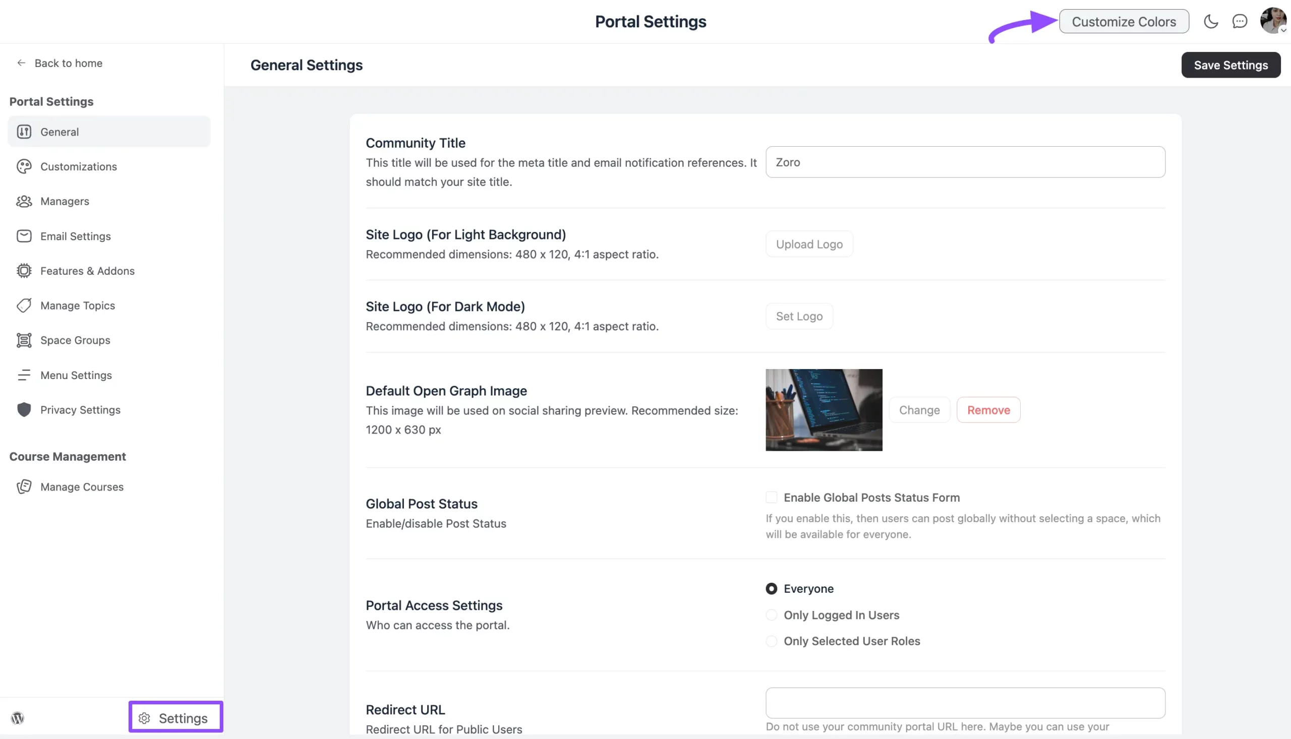
- Go to the Settings page of your portal.
- Click the Customize Colors button in the top-right corner.
Light Mode
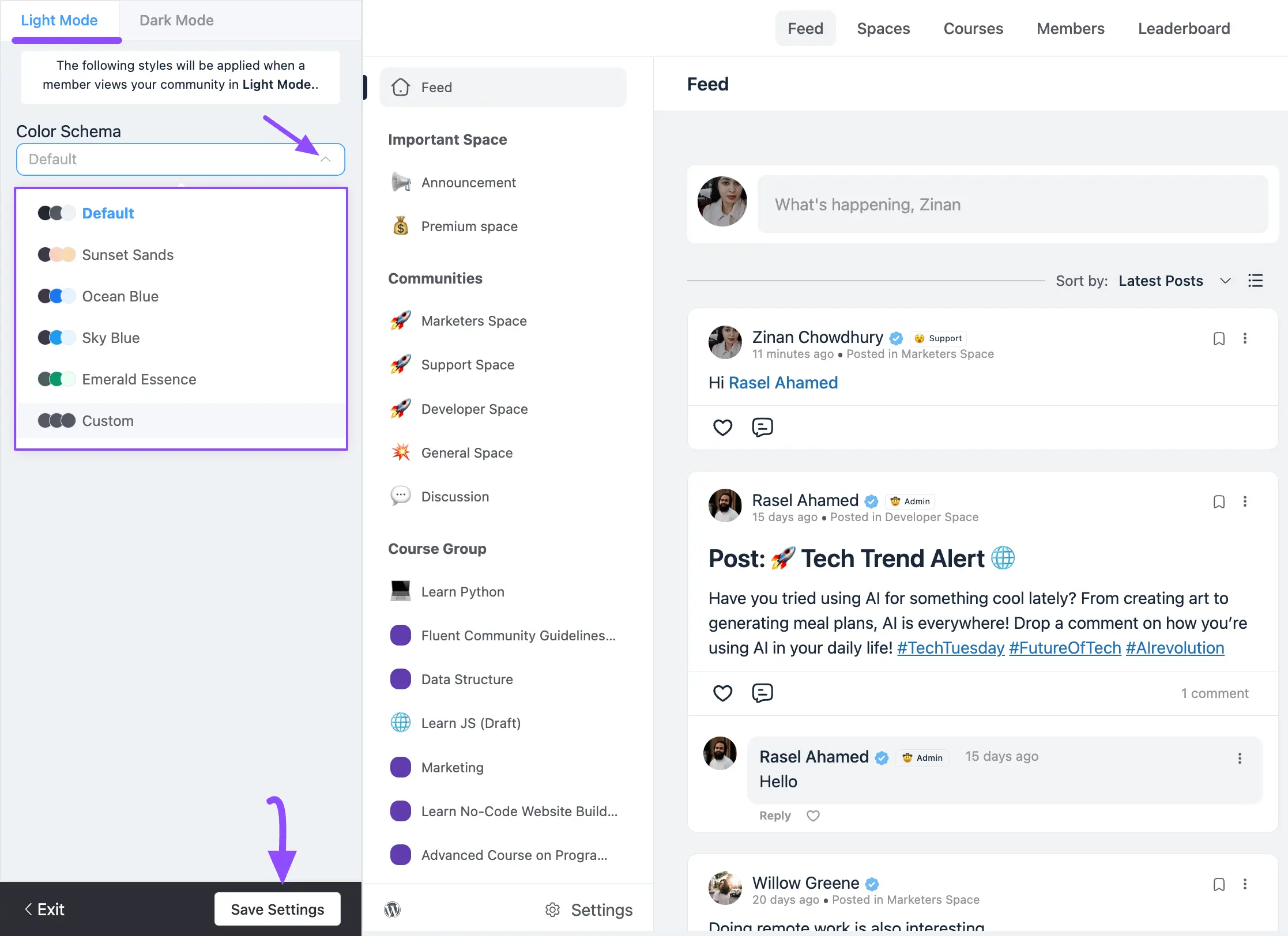
When you open the color customizer, you land on the Light Mode tab by default.
- Click the Arrow icon inside the Color Schema box to open a dropdown of color options.
- Choose any pre-built color template, or select Custom to define your own colors.
- Click Save Settings to apply your changes.
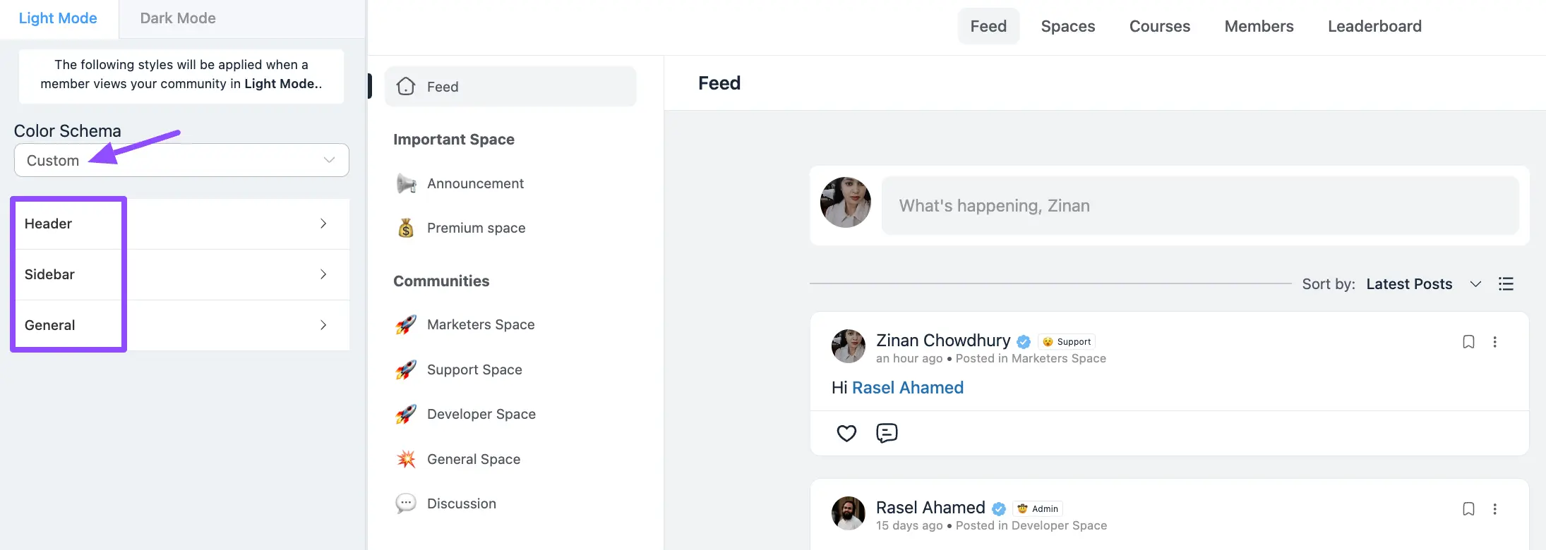
When you choose Custom, three groups of color options become available:
- Header: Colors for the top navigation bar and its elements.
- Sidebar: Colors for the left navigation sidebar.
- General: Colors for the feed, content, links, text, and buttons.
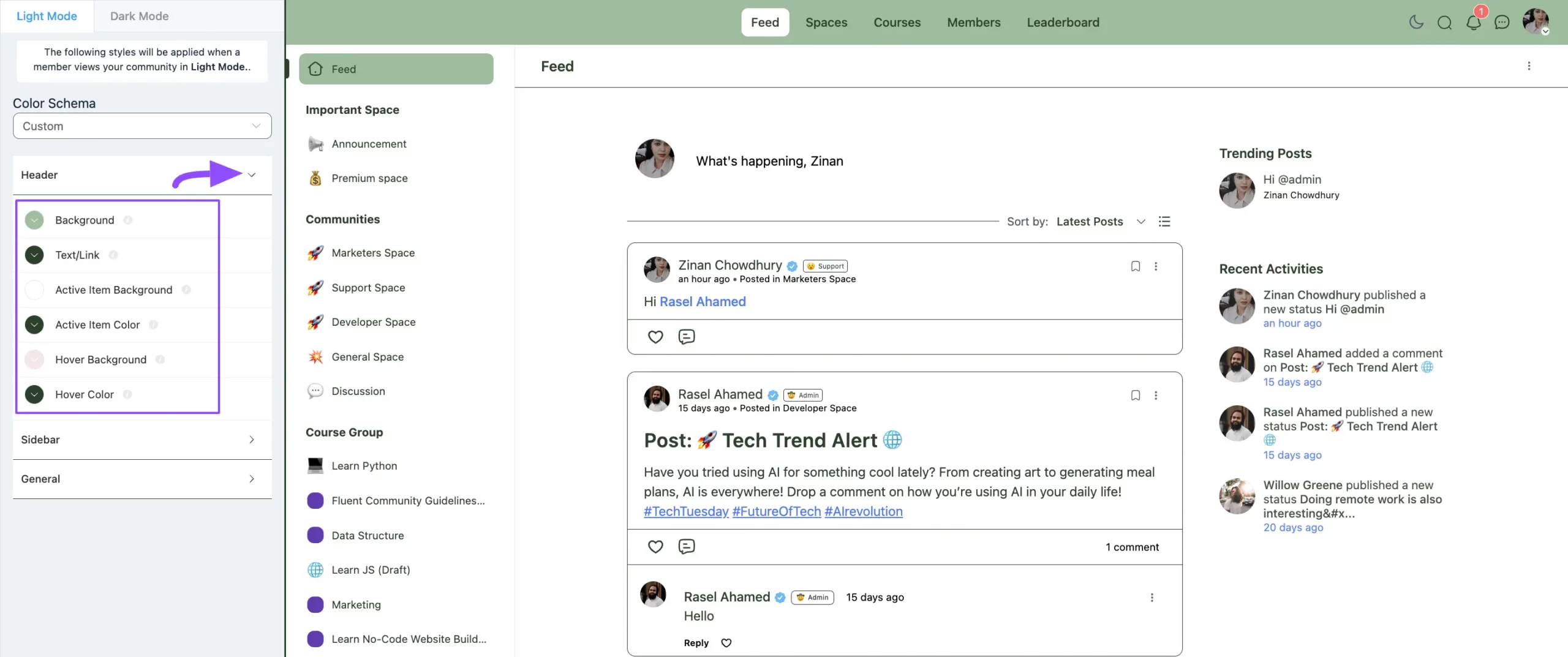
Header
Open the Header group to change the colors of the areas shown below.
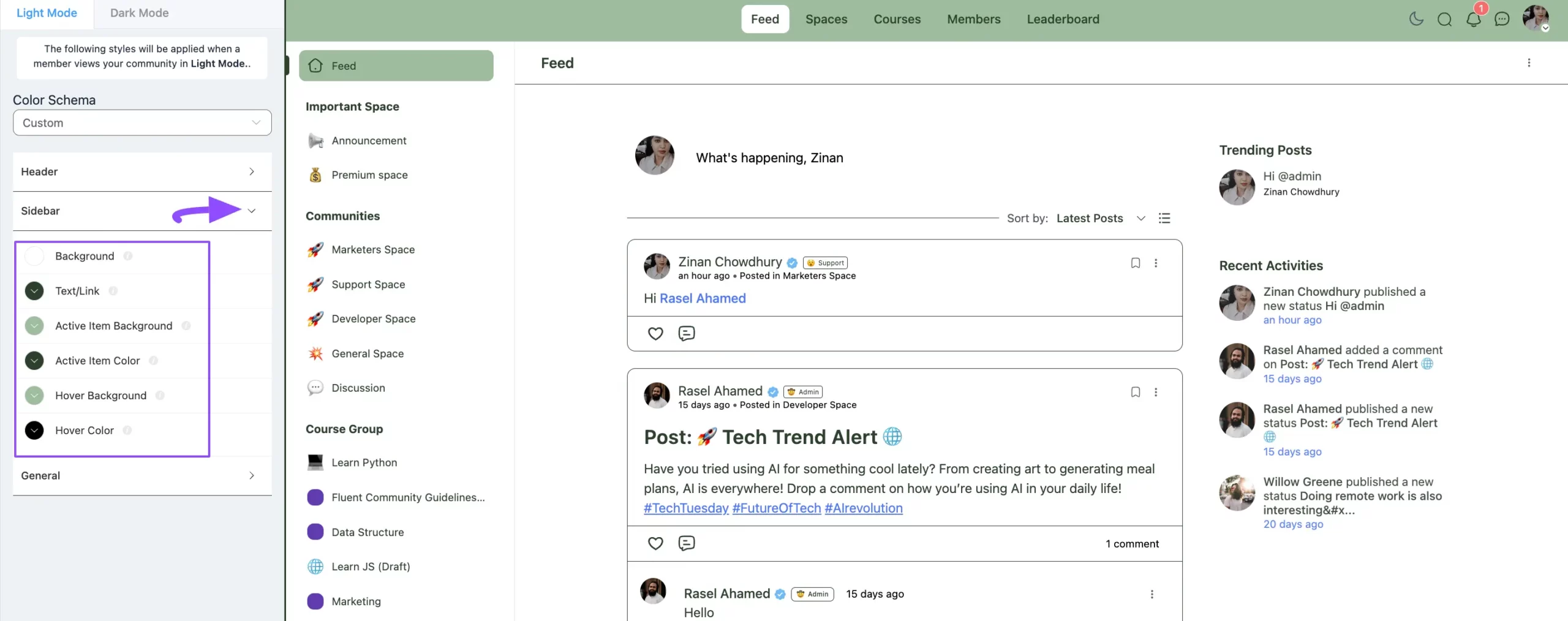
Sidebar
Open the Sidebar group to change the colors of the areas shown below.
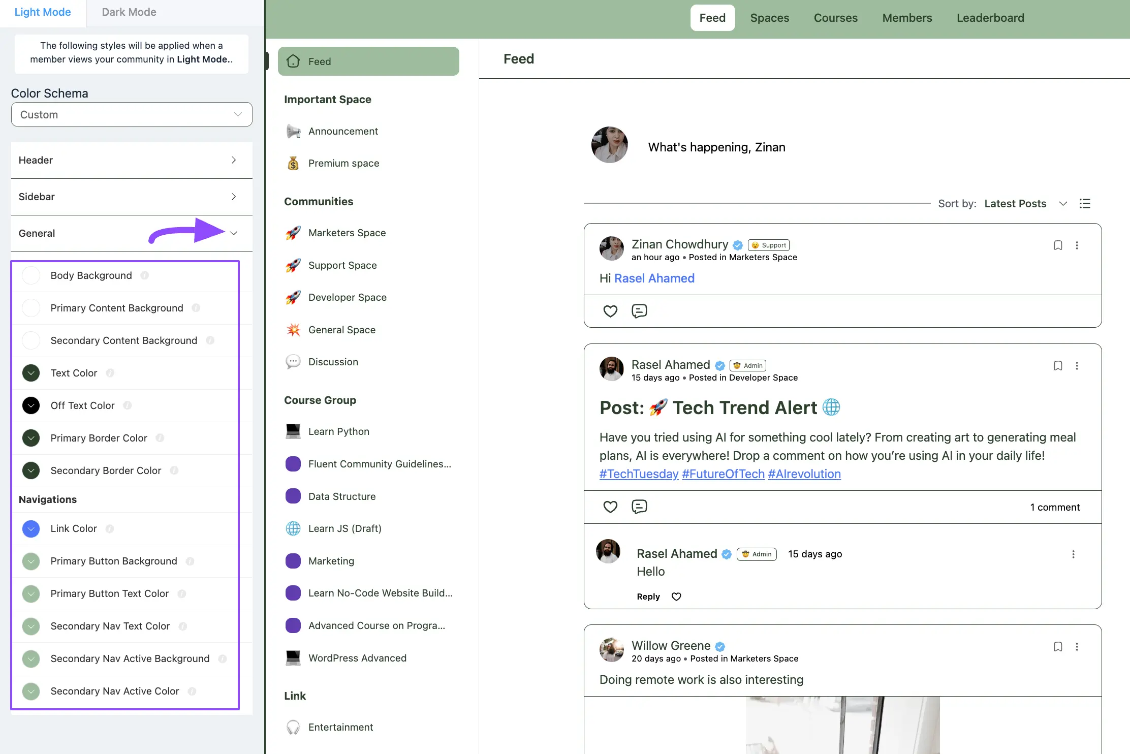
General
Open the General group to change the colors of the areas shown below.
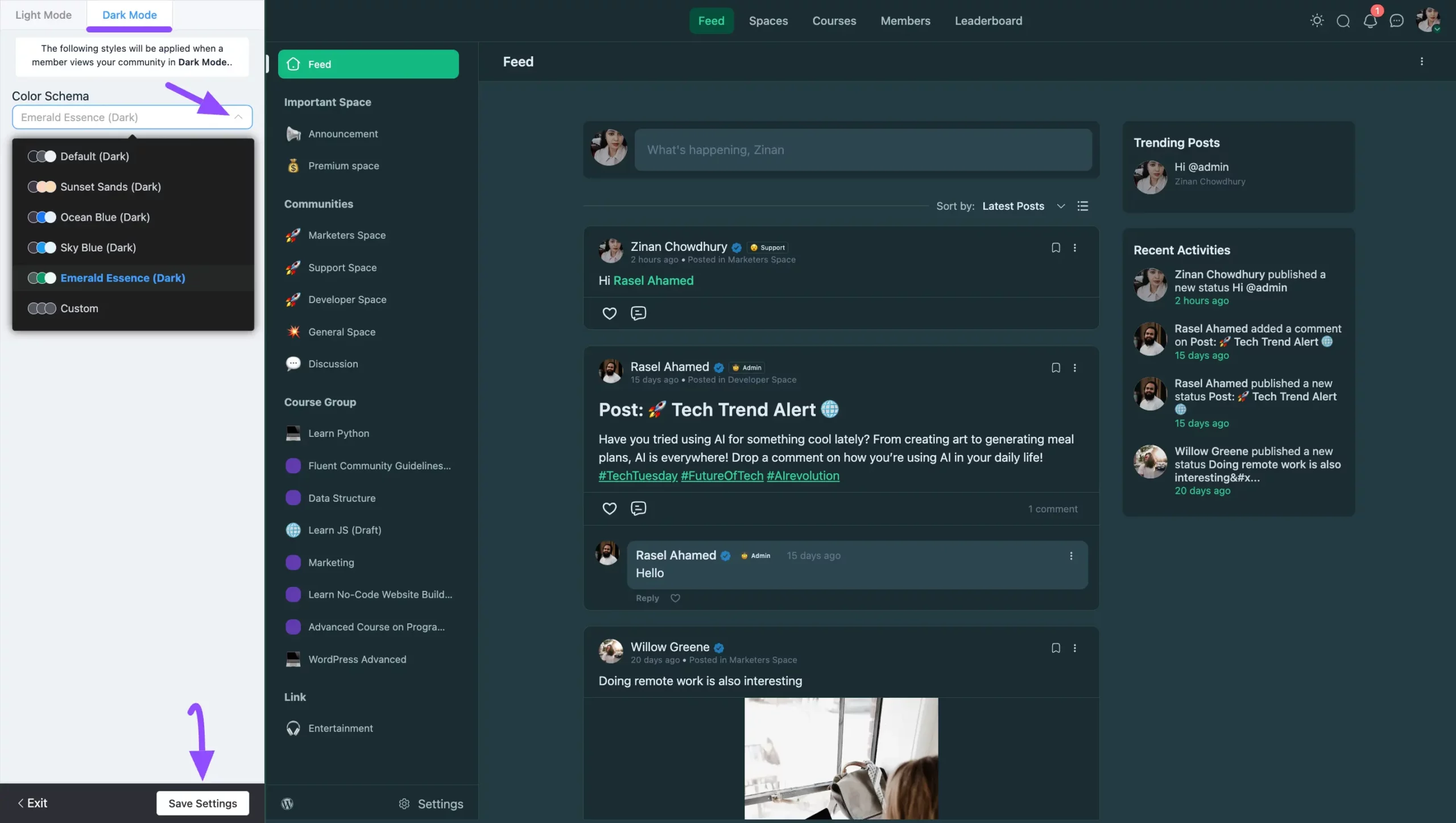
Dark Mode
To style the dark theme, switch to the Dark Mode tab in the color customizer. The process is exactly the same as Light Mode: pick a pre-built template or choose Custom to set the Header, Sidebar, and General colors, then click Save Settings.